By default, most Sections Pro sections center themselves within the viewport with margin and padding built-in on the sides. However, you can make any Sections Pro section extend the full width of the screen if needed. It just requires making a few quick updates to your settings. The documentation below goes through the necessary updates.
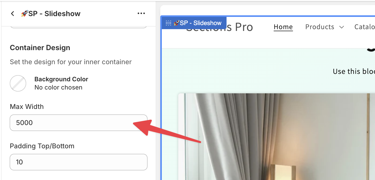
1. Update Max-Width in Container Design
Start by changing the Max Width number to a large number--5000 works well.

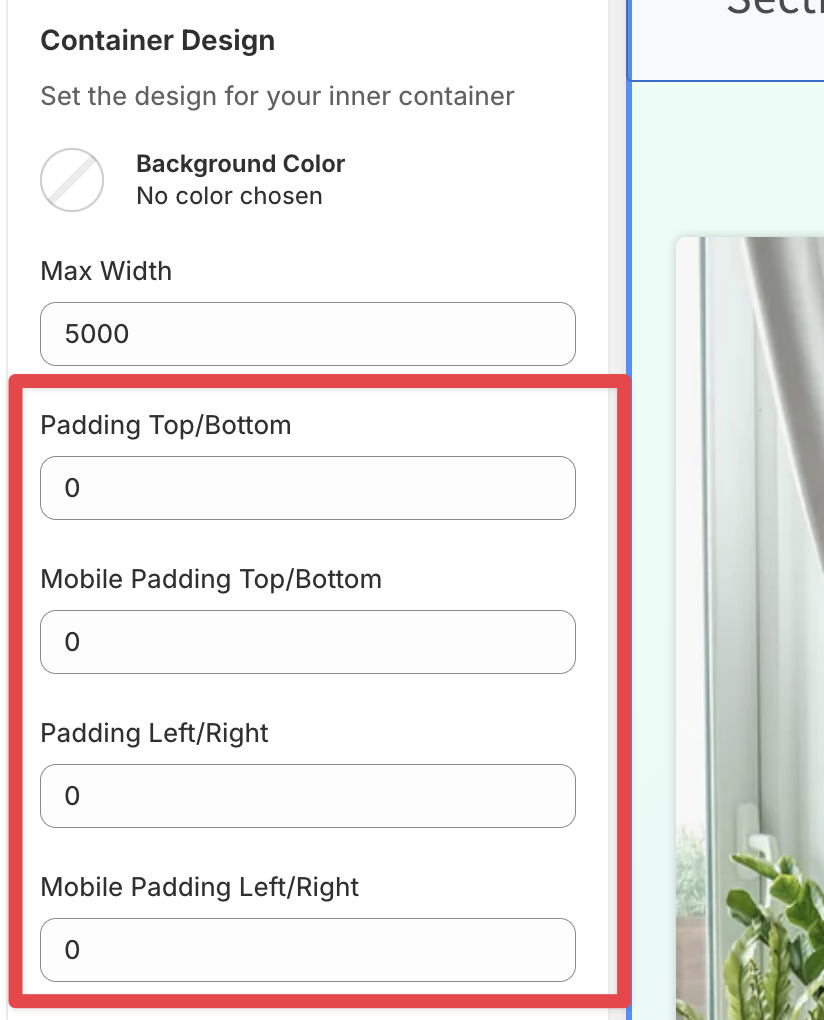
2. Zero out the padding in Container Design
Next, zero out the padding in the Container Design.

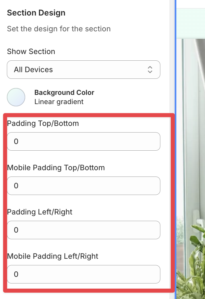
3. Zero out the padding in Section Design
Finally, zero out the padding in the Section Design.

That's it. Your section will now display full width on both mobile and desktop.

 Add to your Store